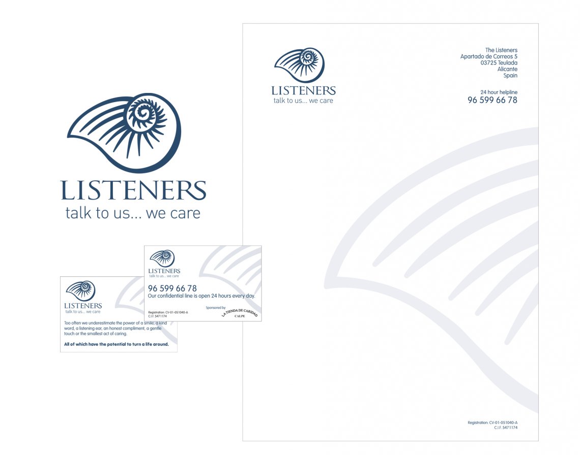
Listeners is a volunteers service based in Spain serving mainly the expat community, and stretching from Southern Alicante to Northern Valencia, who needed a revamp of their current logo as they felt it was dated and conveying the right message.
The chosen design was based on a shell, which fitted well with the aim of the charity, with connotations of calming sounds, life and communication through the use of conch shells.
Finally the colour blue was chosen, as it is both calming in colour and representative trust and peace. It can suggest loyalty and integrity as well as conservatism. From a colour psychology perspective it is believed blue is reliable, responsible and exhibits an inner security and confidence.
It is also thought in the meaning of colours, that blue relates to communication, especially through the voice, which made it the perfect choice to use.
"From a blank sheet you came up with a fantastic modern logo, with some really excellent artwork, from which you have helped us design our literature. You responded to our queries and emails without exception, and when all is said and done, you have been brilliant." - Colin Gaunt, Listeners